


Camo Dark Icon Pack
Creativepixels
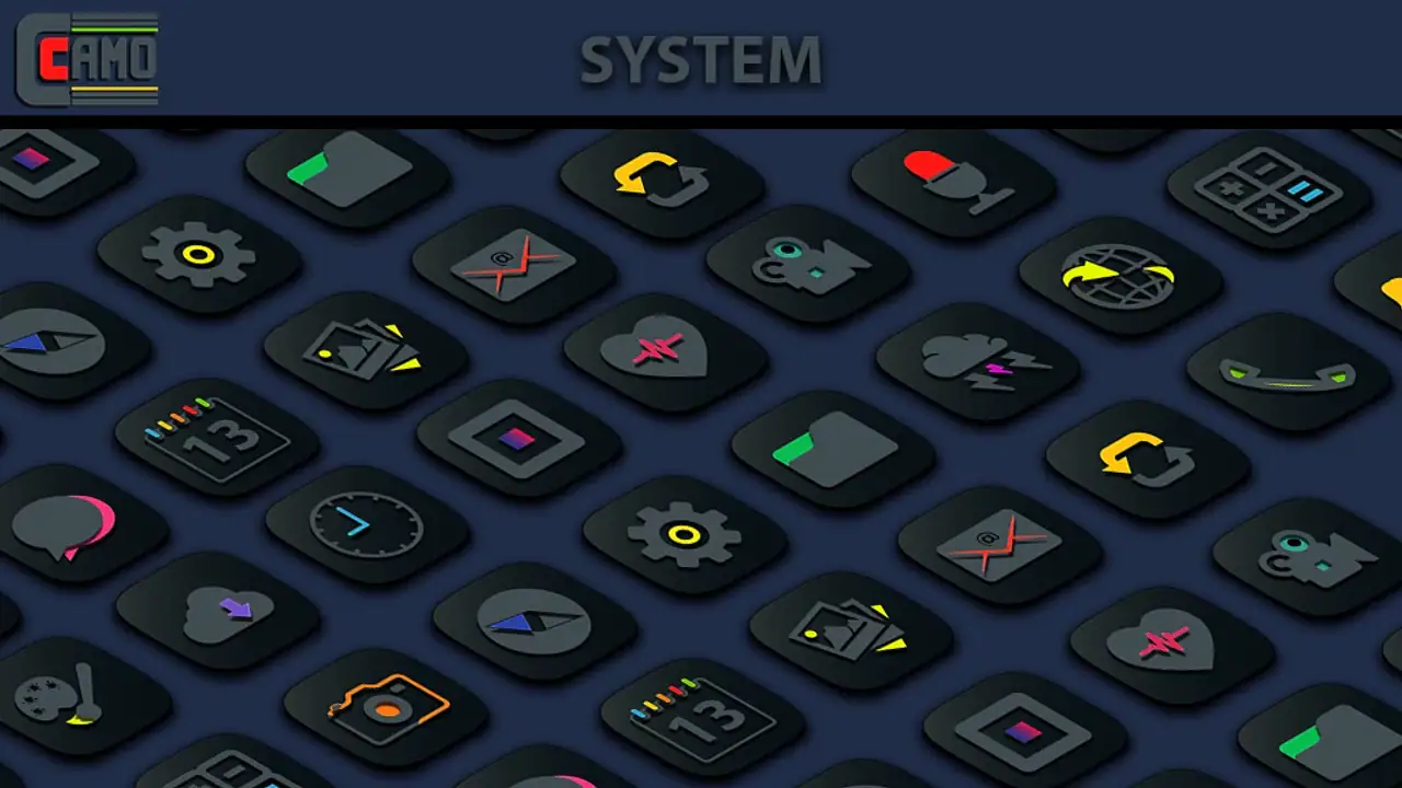
I approached Camo Dark Icon Pack as a small but focused personalization app rather than a complete phone makeover. Its purpose is straightforward: give supported app shortcuts a very dark, camouflaged appearance, with brighter colors used as accents instead of filling the whole icon. That makes it especially interesting if you already use a dark wallpaper, a restrained home-screen layout, or a launcher that lets you control icon size and placement.
My first impression was that the pack has a clear visual opinion. It is not trying to make every icon playful, glossy, or unusually colorful. The design leans into deep black surfaces and selective color, so the result feels calmer than a typical collection of bright Android icons. The effect is strongest on a home screen with plenty of empty space. On a crowded screen, the darker artwork can blend together more than some people will enjoy.
Creativepixels is the developer behind this paid personalization app. It costs $0.69, carries an Everyone age rating, and has reached over 10 thousand installs. Its average rating is 4.5 from around 500 ratings, which suggests that the visual style appeals to a meaningful group of users, although a pack this specialized will naturally divide opinion. I would describe it as a targeted purchase for people who already know they want a dark icon theme, not as a universal choice for every Android phone.
What to expect from the dark visual style
The main attraction is the contrast between nearly black icon backgrounds and small areas of vivid color. That combination can make a home screen look more deliberate without demanding a completely new wallpaper or widget arrangement. In my experience, the pack works best when the rest of the setup follows the same idea: dark background, limited accent colors, and a launcher grid that does not force icons too close together.
This is important because an icon pack cannot solve every design problem by itself. If your wallpaper is bright, highly detailed, or full of competing colors, the icons may look disconnected from it. Likewise, if you prefer large, highly illustrated icons that are instantly recognizable from across the room, the camouflaged treatment may feel too subtle. The darker shapes are part of the appeal, but they also make quick visual scanning less effortless.
Related News

Why WhatsApp Messenger Still Makes Everyday Communication Feel Easy

Jurassic World: The Game Is the Better Dino Tycoon for Strategic Players

Threads in Real Life: Who Should Join, Lurk, or Leave

How SHEIN Turned Shopping Into an Endless Content Feed

How to Make Fortnite Feel Smarter on Mobile

Should You Switch to Microsoft Outlook on Mobile?
I see the pack fitting three practical kinds of setup. The first is a minimalist home screen where only the most-used apps are visible. The second is a night-friendly layout built around a dark wallpaper and subdued widgets. The third is a themed phone where you want colorful accents but do not want every shortcut shouting for attention. In all three cases, the pack adds cohesion without requiring you to redesign the entire device.
There is also a useful trade-off between consistency and recognition. A conventional icon often relies on a familiar logo and bright background to tell you what it is. A dark pack can make several shortcuts feel more related, but that similarity may slow you down until your muscle memory develops. I recommend starting with your dock and first home-screen page rather than changing every visible shortcut at once. That gives you a quick way to judge whether the style helps your daily routine.
Checking compatibility before judging the result
The most important practical detail for a first-time user is the launcher. Icon packs are generally applied through a compatible launcher or through the launcher’s own theme controls, so the experience depends on what your phone uses. Camo Dark Icon Pack is not the same thing as a system-wide redesign that automatically changes every interface element. Your notification shade, settings screens, widgets, and app drawer may keep their original appearance.
Gallery
That distinction prevents a common disappointment. Someone may install the pack expecting the entire phone to turn dark, then wonder why only selected shortcuts changed. The pack is best understood as an icon layer. It can influence the visual identity of your home screen, but it does not replace the operating system theme or redesign individual apps.
The app supports Android devices running version 5.0 or later, and the current version is 1.8.0. Those details make it accessible to a broad range of Android users, including people who are not using a recent phone. Still, Android launchers vary, so I would treat launcher compatibility as part of the setup process rather than assuming that every device will behave identically.
Setting it up without getting lost
My recommended first setup is deliberately small. Install the pack, open it, and look for its application or launcher-integration option. If your current launcher offers an icon-pack setting, select the pack there. If the pack presents a way to apply it directly, use that route first. The goal is not to explore every setting immediately; it is to get one visible row of icons changed so you can evaluate the style in context.
Before applying anything, take a quick look at your current home screen. Notice which shortcuts you use most, which ones are in the dock, and whether your wallpaper already has a dark base. This simple check helps you choose a meaningful test area. Applying a theme to a page you rarely visit tells you very little, while changing the dock gives you immediate evidence about readability and recognition.
One of the more useful habits with an icon pack is to separate visual testing from organizational changes. Do not move widgets, change the grid, replace the wallpaper, and apply the icons all at the same time. If the final screen feels wrong, you will not know which change caused the problem. Apply Camo Dark Icon Pack first, then decide whether the wallpaper or spacing needs adjustment.
If the pack does not appear to change anything, check the launcher’s icon settings before assuming the installation failed. Some launchers require you to choose an icon pack manually. Others may apply only supported icons automatically, leaving shortcuts without a matching design untouched. A phone can therefore show a mixture of themed and original icons, especially when you use less common apps.
That mixed result is not necessarily a flaw in the artwork. It is a normal limitation of relying on launcher support and icon coverage. The practical question is whether the unmatched icons are important enough to disturb your layout. If they are, you can keep those shortcuts on a secondary page, place them in folders, or use the pack only for the dock and primary screen.
The first successful action to aim for
For a first-time user, success should mean more than opening the app. I would define it as applying the pack to the shortcuts you touch most often and then completing an ordinary task without hunting for the right icon. Open your usual communication app, camera, browser, or music shortcut from the newly styled screen. If the dark design still lets you identify those actions comfortably, the pack is doing its job for you.
A useful test is to use the phone in two different lighting conditions. In a dim room, the black artwork may feel calm and unobtrusive. In bright daylight, the reduced contrast between icon elements and the background can become more noticeable. This is one of the non-obvious decisions behind the pack: the same visual restraint that looks elegant at night may require more attention during the day.
I also suggest testing the icons after you have placed them beside your favorite widget. Widgets often introduce their own colors, borders, and typography. Camo Dark Icon Pack can look polished next to a simple dark clock or weather widget, but a bright, heavily illustrated widget may make the icons seem dull by comparison. You do not need to replace the widget immediately; simply use the contrast to decide whether the pack belongs on one page or across the whole launcher.
Another practical workflow is to reserve the first page for high-frequency apps and use folders for everything else. That reduces the number of icons that need to be visually distinctive. The dark treatment then becomes a navigation aid through layout and position rather than color alone. After a few days, you may find that you recognize the shortcuts by location, making the subdued artwork much easier to live with.
Where new users commonly get confused
The first point of confusion is expecting every app to change. Icon packs depend on the launcher and on the icons included or recognized by the pack. If one shortcut remains in its original style, that does not automatically mean the whole pack is broken. Look at several common shortcuts and check whether the launcher has an option for unsupported or missing icons before making a final judgment.
The second confusion is mistaking the pack for a full dark mode. It changes the appearance of icons, not necessarily the interface inside each app. If you want dark menus, dark notification controls, and dark application screens, you will need to use your phone’s system theme or each app’s own appearance settings as well. The strongest result comes from combining those separate layers thoughtfully rather than expecting one purchase to control them all.
The third issue is visual similarity. Because the icons share a dark treatment, some may be less immediately distinguishable than the colorful originals. I would not recommend applying the pack to a phone used by someone who depends on instant color recognition, or to a device shared with a family member who has not learned the new layout. For personal use, the problem usually becomes smaller once the positions are familiar, but it is worth considering before changing a busy app drawer.
A fourth source of friction is the difference between an icon in the launcher and an icon inside a widget or shortcut panel. A themed home-screen shortcut may change while a widget’s internal buttons remain untouched. That can create an uneven appearance, especially if you use many widget-based controls. In that situation, the pack may still work well on a clean first page, but a heavily customized dashboard could look less unified.
There is also a maintenance question. If you frequently change launchers, reset your home screen, or reorganize shortcuts, you may need to revisit the icon-pack setting. That is not unique to this product, but it matters more when the visual identity depends on consistent application. Users who want a set-it-once experience with no launcher involvement may prefer a phone theme built directly into their device instead.
Going further with a more coherent setup
Once the first page feels comfortable, I would expand gradually. Start with the second page or a small folder group, then compare the result with the original layout. This staged approach reveals whether the pack improves the whole phone or only works as an accent on the most visible shortcuts. It also lets you keep a practical fallback page if certain icons are harder to recognize.
Wallpaper choice makes a larger difference than many people expect. A nearly black or low-detail wallpaper gives the icons room to show their color accents, while a busy photograph can swallow their darker edges. I would avoid choosing a wallpaper solely because it is dark; look for one with enough separation around the icon positions. Subtle contrast is still contrast, and it helps the camouflaged shapes remain usable.
Spacing is another advanced but simple adjustment. If your launcher allows changes to the grid or icon size, test a slightly less crowded arrangement rather than immediately enlarging everything. The pack’s visual character depends on the dark forms having breathing room. Too many icons packed together can turn the intended sleekness into a wall of similar shapes.
Folders can be used creatively here. Instead of placing every rarely used shortcut on the main screen, group them by task and leave only the most important actions exposed. The themed icons then function almost like a visual frame for your daily workflow. This is especially effective for people who want a clean screen but still need access to many apps through a predictable folder structure.
One trade-off is that a highly consistent layout may matter more than the individual quality of any one icon. If a few essential apps do not match, you have three sensible choices: keep the original shortcut and accept the contrast, hide it inside a folder, or use the pack only where coverage feels complete. I prefer the second option for low-frequency apps, because it preserves a clean first page without pretending that every shortcut has the same visual treatment.
Compared with ordinary launcher icon alternatives, this pack is more specialized than a broad, colorful theme and less comprehensive than a full device skin. A general icon collection may offer faster recognition and a wider range of moods. A built-in system theme may integrate more deeply with menus and controls. Camo Dark Icon Pack makes more sense when your priority is the particular balance of black surfaces and bright accents, and when you are comfortable letting the launcher handle the application.
Who should use it, and who should skip it
I would recommend it to someone who enjoys minimalist personalization, uses a compatible Android launcher, and wants a home screen that feels darker without becoming completely monochrome. It is also a good fit for a person who likes arranging apps by position and wants colorful details to remain present but restrained. The low purchase price makes it an easy experiment if that description matches your taste.
I would be more cautious if you rely on bright, instantly recognizable icons, keep a colorful wallpaper, or expect every app and system screen to change together. The pack may still be usable, but it will not solve those preferences. I would also skip it if you do not want to adjust launcher settings or tolerate a few unmatched shortcuts. A system-level theme or a broader icon style would be a better direction in those cases.
For a first-time user, the safest path is simple: apply it to the dock, test your most-used shortcuts, check the result in both dim and bright surroundings, and only then extend it to the rest of the home screen. That process gives you a meaningful result quickly and avoids the common mistake of changing the entire phone before knowing whether the darker icons suit your eyes.
After using it this way, my opinion is positive but specific. Camo Dark Icon Pack is strongest as a controlled finishing touch for a dark, uncluttered Android layout. It delivers a recognizable mood rather than an all-purpose redesign, and its limitations are closely tied to that focused approach. If you want deep black icons with lively accents and are willing to make the launcher part of the setup, the $0.69 purchase is easy to justify. If you want broad customization with no compromises in recognition or system-wide coverage, another personalization route will likely serve you better.
FAQs for Camo Dark Icon Pack
What is Camo Dark Icon Pack, and what does it change on my device?
Camo Dark Icon Pack is a themed collection of dark, camouflage-inspired icons designed to give an Android home screen a more rugged and understated appearance. After applying it through a compatible launcher, supported app icons are replaced with the pack’s custom artwork. It may also include wallpapers or alternative icons, while unsupported apps can usually be matched manually or left with their original appearance.
Which launchers are compatible with Camo Dark Icon Pack?
Compatibility depends on the launcher installed on your Android device. Icon packs commonly work with popular third-party launchers such as Nova Launcher, Lawnchair, Smart Launcher, Action Launcher, and similar customization tools, but support can vary by version. The pack generally cannot be applied directly through every stock launcher, so check its launcher list and your phone’s requirements before downloading.
Does Camo Dark Icon Pack support every application icon?
No icon pack can guarantee coverage for every app, particularly newer, regional, or less popular applications. Camo Dark Icon Pack may include a large selection of themed icons, but some apps can remain unchanged. Depending on the launcher, you may be able to request missing icons, select an alternative included icon, or manually edit an app shortcut using the pack’s available artwork.
How do I apply Camo Dark Icon Pack after installing it?
Install the pack, open its dashboard, and look for the apply option or supported-launcher instructions. Select your preferred launcher from the list and confirm the change. If automatic application is unavailable, open the launcher’s icon settings and choose Camo Dark Icon Pack manually. The exact menus differ between launchers, and some stock Android interfaces may require a compatible third-party launcher.
Is Camo Dark Icon Pack free, and are there any limitations to consider?
Availability and pricing can vary depending on the store listing and developer updates. Before downloading, review whether the pack is free, contains optional purchases, or requires a supported launcher for its main features. It is also worth checking update activity, icon coverage, and device compatibility. The pack changes visual elements only and does not normally improve performance or add system-level functions.
Pros
- Includes a large collection of dark-themed icons for consistent home-screen styling.
- Works with many popular Android launchers and supports easy icon replacement.
- Crisp designs remain clear at different icon sizes and screen resolutions.
- Frequent updates may add support for newer apps and additional icon requests.
- Includes matching wallpapers that help complete the dark visual theme.
Cons
- Some apps may lack dedicated icons and use generic alternatives.
- Requires a compatible launcher; it may not work with every Android interface.
- The dark palette can reduce contrast on certain wallpapers or widgets.
- Icon requests may take time before unsupported apps receive custom designs.
- Some advanced launcher features may require separate paid launcher apps.


